Why visualisation matters
How visualising data leads to insights
June 2023
As the saying goes, a picture is worth a thousand words. Visualisation is important for telling stories about data, but it also allows you to view data from a new perspective. Visualisation can often uncover insights that might have otherwise not been recognised when looking at pure data.
As an example, I've taken data on the top 100 baby names in NSW between 1952 and 2022 and the total births in NSW between 1975 and 2021, and created some visualisations using Python (matplotlib and seaborn libraries) to show how impactful visualisation can be to uncover new insights.
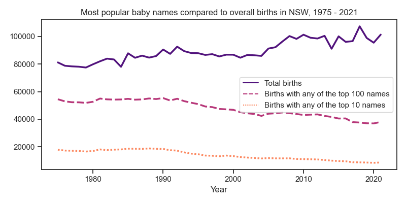
First, I compared the trend of the total number births in NSW with the trend of the number of births having the top 10 names and top 100 names.
Data sources: Australian Bureau of Statistics (births by state) and Data.NSW (popular baby names).
An interesting observation is that as births in NSW increased, the total volume of popular names decreased. This may suggest that baby names are becoming more diverse and unique over time, as the overall percentage of babies being given popular names is decreasing.
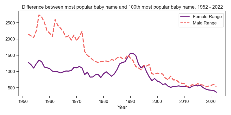
Let's look at the data from a different perspective. The following chart shows the difference between the number of births for the #1 name and the number of births for the #100 name over time (i.e. the range of the most popular name and the 100th most popular name).
Data source: Data.NSW (popular baby names).
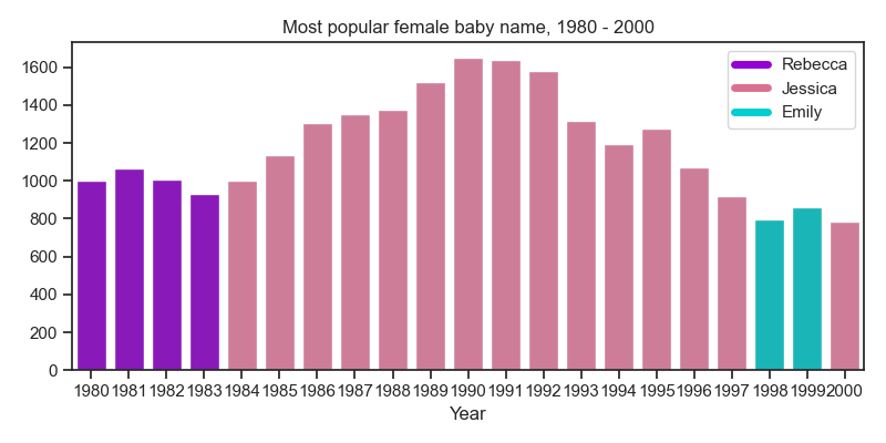
This visualisation shows the range becoming smaller over time, but it also shows a very interesting data point around 1990 with the female range increasing and then dropping back down to the decreasing trend. It's quite a stark increase in the data, so let's check it out further! What was the most popular female baby name over this period?
Data source: Data.NSW (popular baby names).
Turns out the name Jessica was very popular, with almost 600 more names than the previous top name (Rebecca) at its peak, and being the #1 name for over a decade.
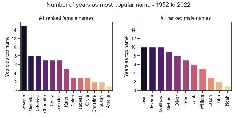
Let's look at the data from another perspective - of all the names which were the most popular in any given year, how many years was each name ranked #1?
Data source: Data.NSW (popular baby names).
This view shows that Jessica was the #1 ranked baby name for 15 years, almost double the next most popular names (Michelle and Rebecca at 8 years). For male names, the names David, Joshua, and Matthew all share the honour of being the #1 ranked name for 10 years each. Even though Jessica was top ranked for the most years, the female names have more overall names in the #1 position compared to the male names.
Let's view the most popular names as one last visualisation - the below chart show the top 10 female names over the entire time period, and the density of each name per year (i.e. each individual name's popularity over time).
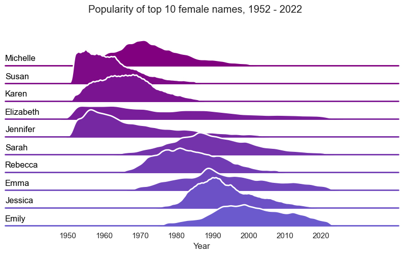
Data source: Data.NSW (popular baby names).
The next chart shows the same information for the top 10 male names over the entire time period.
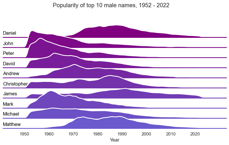
Data source: Data.NSW (popular baby names).
When looking at the data from this perspective, we can see that the top male names have been more consistently popular over multiple decades, whereas female names have trended differently with certain names becoming only recently popular. In fact, only Elizabeth appears to have been a consistently popular name over the last 70 years.
For more options on visualising data with Python, check out seaborn and matplotlib.